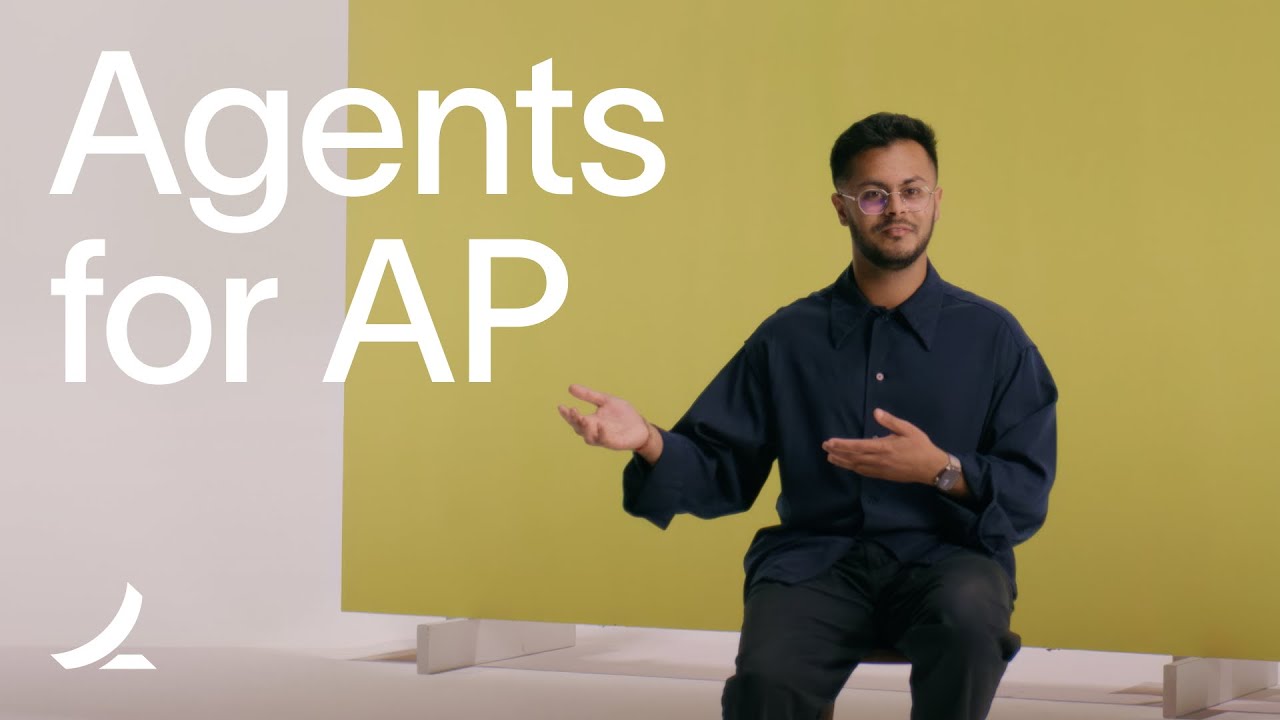
What Rippling shipped
Rippling’s introduction of its native AI layer targets a specific enterprise friction point: the gap between querying data and executing tasks across disparate systems. The 2026 launch positions their AI not just as a conversational interface, but as an operational engine capable of reading live company data and taking immediate action across HR, IT, and finance.
For a product dealing with dense, multi-departmental workflows, the launch film needs to communicate both breadth and precision. The resulting piece leans heavily on sharp typography and aggressive editing to make abstract system-spanning claims feel concrete, fast, and highly legible.
How the motion works
Enterprise software videos often drown in voiceover and floating UI. Rippling avoids this by using kinetic typography as the primary narrative driver. Large, rigid typographic elements snap into place, setting a relentless, metronomic pacing. This typographic treatment dictates the rhythm of the edit, ensuring the viewer processes the core capabilities before the product interface even appears.
When the film transitions to the product, it relies on tight punch-ins to manage the visual density of the dashboard. Instead of showing full-screen interfaces where the user's eye might wander, the camera snaps directly to the relevant input fields and action buttons. These punch-ins utilize steep easing curves to emphasize the speed of the AI's response over the complexity of the underlying software.
To establish the tool's cross-departmental utility, the edit employs rapid hard cuts between HR, IT, and finance vignettes. There are no sweeping camera moves or fluid transitions bridging these distinct environments. The hard cuts serve a structural purpose, compartmentalizing the use cases and proving the AI's versatility without muddying the visual language.
The concept of taking action across disparate systems is inherently abstract, but the motion design solves this through staggered data animations. When a command is executed, cascading rows of data and confirmation states animate sequentially. This stagger technique gives invisible backend processes a physical, domino-like momentum, translating complex database queries into a concrete visual payoff.
What to steal from it
- Drive the narrative rhythm with kinetic typography to prevent dense enterprise messaging from feeling sluggish.
- Use tight punch-ins to isolate specific UI actions rather than forcing viewers to scan full-screen dashboard layouts.
- Rely on hard cuts to transition between distinct product use cases to maintain momentum and avoid structural ambiguity.
- Animate abstract backend actions with staggered visual elements to give invisible processes a satisfying, physical weight.
Want a video like this for your product?
Impractical cuts one from a single prompt — the same motion craft, in about twenty minutes.