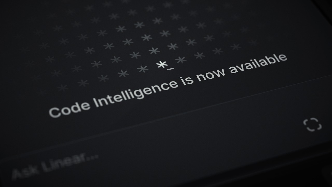
What Linear shipped
Linear built its reputation on uncompromising speed and craft in issue tracking. With Linear Reviews, they step directly into the developer workflow, offering a code review experience built for both human engineers and AI agents.
At just 26 seconds, this announcement is a pure momentum play. It operates less as a comprehensive feature tour and more as a statement of intent, relying on Linear’s established visual authority to drive waitlist signups.
How the motion works
Linear’s motion language is defined by restraint and precision, and this short film leans heavily into that established vernacular. The edit relies on hard-cut transitions synchronized to a driving, minimalistic audio track. There are no crossfades or soft transitions; every cut is an absolute, mirroring the binary nature of the code it manages.
The camera work treats the UI as a physical landscape. Slow, deliberate camera-drift movements glide over the dark-mode interface, establishing spatial relationships before a rapid punch-in isolates a specific interaction. This contrast between the slow pan and the sudden scale shift creates a rhythmic tension that holds the viewer's eye.
Typography is treated with the same utilitarian elegance as their product design. Text elements are used sparingly to punctuate key value propositions, often snapping into place or revealing through strict masks. The text doesn't dance; it arrives. This reinforces the brand's core promise of speed and clarity.
Because the runtime is so compressed, the film relies on pattern-interrupt techniques to maintain engagement. Just as the viewer settles into a rhythm of UI shots, the sequence breaks for a stark, full-screen typographic beat. It’s an exercise in editing economy, proving that a launch video doesn't need to explain everything if it can make the viewer feel the product's quality.
What to steal from it
- Treat your UI like a physical environment by using deliberate camera drifts.
- Use hard cuts on the beat to create a sense of speed and decisiveness.
- Contrast slow, continuous movement with sudden punch-ins to direct focus instantly.
- Let typography arrive with purpose rather than over-animating its entrance.
- Keep the runtime tight to leave the audience wanting more rather than exhausting their attention.
Want a video like this for your product?
Impractical cuts one from a single prompt — the same motion craft, in about twenty minutes.